Review: Blogspot’s New ‘Template Design’ Features
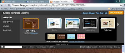
I’ve been blogging with ‘Blogspot’ for two years now and have always been on the look out for new free templates for my site. The new additions to the ‘Design” feature for blogspot users are awesome! It’s user friendly, easy to learn and fun to do.
Of course I’m bias but I’m determined to convince you why Blogspot is the best way to go so read on fellow bloggers.
Although the free templates available at the “Design” page are limited, you can adjust the following:
Background – artistic patterns to scenic photos
Layout – From single to 4 columns. Do you want your posts in the center, side menus on the left or right? Up to you.
Width – This is my favorite item. You can adjust the width of your template. You can adjust the center and side menus to how wide or narrow you want them.
And all for free! If you’re like me, on a strict budget and not a tech savvy but enjoy having your own site that you can design and re-design without having to learn or write codes, this is an awesome deal.
If you’re a newbie at blogspot and haven’t learned your way around yet, here’s how you can get to the “Design Template” page:
- Go to your Dashboard
- Click Design
- Choose Design Template
- To choose number of columns you want and where you want your post, choose layout
- To adjust the width of your side menus and post area – click adjust width
- Once your done with the adjustment and satisfied, click the “apply to blog” button at the top right corner of the page.
Hope that helps.
So why am I writing about this and “Blogspot”? What would I get from doing so? I’m already getting free service that’s enough reason for me. And yes, I've just learned to do screen shots - yay!
So blog it and enjoy designing your site!
"Jesus Christ loves you and died for you."


Comments